Overlay Settings
Overlay Settings let you create and manage the overlays Supertip uses to display your tips, goals, and QR code on stream — and build the layout of each one from composable layers. To open them, go to the Creator Dashboard and select Settings > Overlay.
Managing your overlays
Section titled “Managing your overlays”The Overlays section lets you create and configure multiple Supertip overlays. A default overlay is already set up for you, and you can create your own with the Create Overlay button. Each overlay you build has its own layout and its own URL, so you can switch between different setups for different scenes or streaming software.
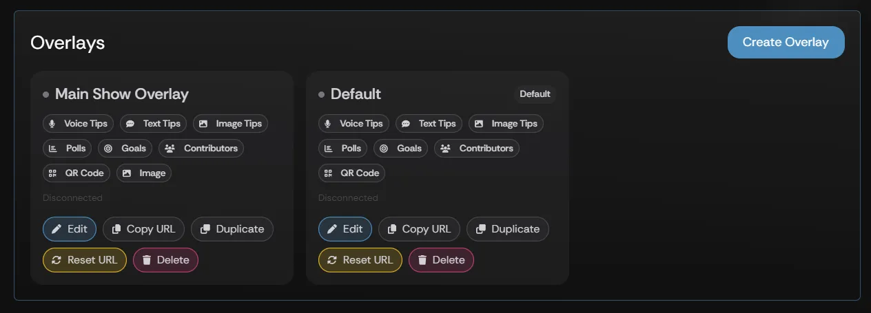
Each overlay in the list has its own set of details and actions.
| Setting | What it does |
|---|---|
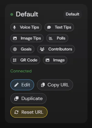
| Overlay Connection Status | Shows whether the overlay is connected to your open streaming software or browser. Connected means the overlay is linked to streaming software or a browser you have open — you can play tips from the Unplayed queue. Disconnected means the overlay is not linked — you cannot play or clear tips from the Unplayed queue. |
| Overlay Title | The name of the overlay. |
| Overlay Layers | The types of tips and features configured in the overlay. An overlay can include Voice Tips, Text Tips, Image Tips, Polls, Goals, Contributors, the QR Code, static Images, Statuses, and Live Chat. |
| Edit | Lets you customize the layout of the overlay. |
| Copy URL | Copies the overlay’s URL so you can configure it into your streaming software. See Overlay Setup for how to use the URL in OBS, Evmux, or Streamyard. |
| Duplicate | Creates a copy of the selected overlay that you can configure into a new overlay. |
| Reset URL | Creates a new URL for the overlay, which you can then copy with Copy URL. |
| Delete | Deletes the selected overlay. |
Creating & editing an overlay
Section titled “Creating & editing an overlay”A default overlay already exists. You can build a new one with the Create Overlay button, or change an existing one with Edit Overlay. Either choice opens the overlay editor, where the LAYOUT section shows where each element appears on your overlay and the LAYERS section lists the layers the overlay is built from.
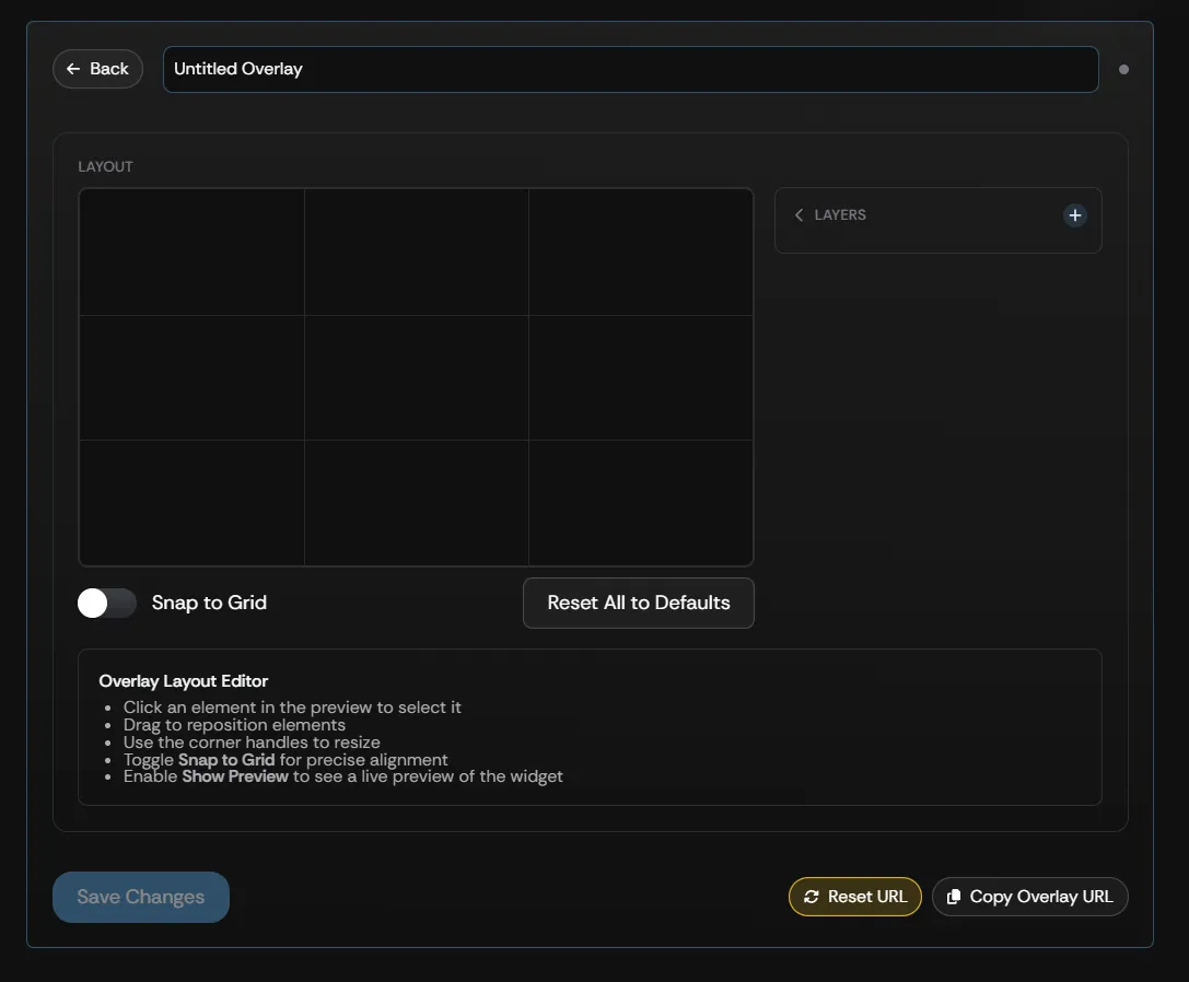
To create a new overlay:
- Enter a title for the overlay in the Untitled Overlay text box.
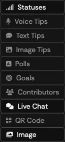
- Select the plus sign next to the LAYERS box, then choose the tip or feature you want to add. The menu offers Voice Tips, Text Tips, Image Tips, Polls, Goals, Contributors, QR Code, Image, Statuses, and Live Chat. Every layer type except Image can be added once per overlay.
- Your selection appears in the LAYOUT box, where you can resize it and reposition where it appears on the overlay.
The layers panel
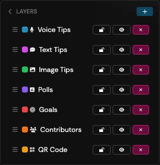
Section titled “The layers panel”Once you have added elements to your overlay, you can change how those elements are configured from the LAYERS panel.
| Setting | What it does |
|---|---|
| Layer Order | Click and drag to re-order the selected layer within the overlay layout. |
| Lock | Toggle to lock or unlock the position of the selected layer. |
| Toggle Visibility | Hide or show the layer. A hidden layer is not rendered on your live overlay — viewers will not see it on stream until you make it visible again and save your changes. |
| Delete | Deletes the layer from the overlay layout. |

Repositioning & resizing
Section titled “Repositioning & resizing”The large box in the LAYOUT section represents your Supertip screen overlay as viewers see it. Use it to arrange where each element appears.
To reposition an element:
- Select the element you want to move.
- Drag the element to its new position within the overlay box.
- Select Save.
To resize an element:
- Select the Snap to Grid toggle if you want exact alignment for each element (optional).
- Select the corner handle of the overlay element you want to resize.
- Drag the handle to resize the element within the overlay box.
- Select Save.
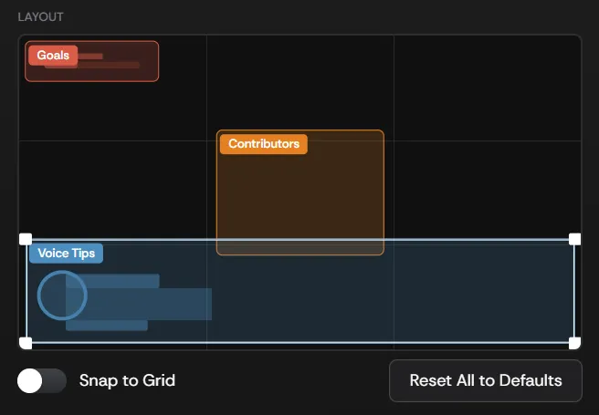
Use the Snap to Grid toggle for exact alignment when positioning or resizing elements. Selecting Reset All to Defaults returns every element to its default position and size, and clears each tip layer’s entrance and exit animations back to the default.
Tip animations
Section titled “Tip animations”The Voice Tips, Text Tips, and Image Tips layers each have an Animation section with an Entrance and an Exit preset. The presets apply to every tip played on that layer, and direction-aware presets follow the layer’s Align setting — a slide travels toward the nearest edge, and pop, flip, and zoom grow from the aligned corner.
| Entrance | Exit |
|---|---|
| None — appears instantly | None — cuts straight out |
| Slide — from nearest edge | Slide — to nearest edge |
| Pop / spring — spring settle | Pop / spring — shrinks away |
| Fade + rise — soft rise (default) | Fade + rise — sinks out (default) |
| Bounce drop — drops in | Bounce drop — hops off |
| Pill sweep — parts stagger in | Pill sweep — parts peel off |
| Flip — swings on edge | Flip — swings shut |
| Glitch — signal jitter | Glitch — signal drop |
| Zoom punch — punches back | Zoom punch — blows past |
Select the play button next to either preset to preview it — the layer’s example tip switches on and replays. Choosing a new preset from the menu previews it automatically.
Voice Tips
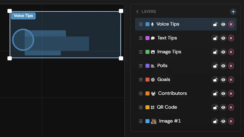
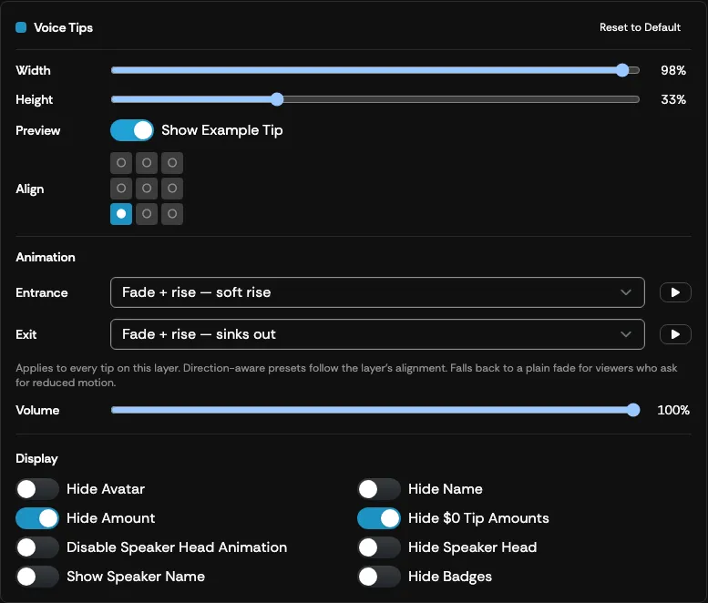
Section titled “Voice Tips”To open the Voice Tips settings, select the blue Voice Tips box from the LAYOUT section, or select the Voice Tips option from the LAYERS box. These settings control how Voice Tips appear on your overlay.
| Setting | What it does |
|---|---|
| Voice Tips Width | Use the slider to adjust the width of the overlay box. |
| Voice Tips Height | Use the slider to adjust the height of the overlay box. |
| Show Example Tip | Toggle to show an example of how an actual Voice Tip appears on the overlay. The example uses your first enabled speaker, so the speaker-head settings below are visible in the preview. |
| Align | Adjusts where the Voice Tip aligns within the box on the overlay layout. |
| Entrance / Exit | The animation presets used when a voice tip appears and leaves. See Tip animations. |
| Hide Avatar | Hides the viewer’s avatar when the tip is played. |
| Hide Name | Hides the viewer’s name when the tip is played. |
| Hide Amount | Hides the dollar amount the viewer spent on the played tip. |
| Hide $0 Tip Amounts | Zero-dollar tips do not show the dollar amount. |
| Hide Badges | Hides the viewer’s badges when the tip is played. |
| Disable Speaker Head Animation | By default, the speaker image moves in sync with the audio when a voice tip plays. Enable this setting to keep the speaker image static while the voice tip plays. |
| Hide Speaker Head | When enabled, the speaker image does not display while the voice tip plays. |
| Show Speaker Name | When enabled, the AI voice speaker’s name is displayed while the voice tip plays. |
| Volume | Use the slider to set the playback volume of voice tips on this overlay, from 0% to 100%. Voice tips and Announcer lines are normalised to a consistent loudness before they play, so a tip never comes through louder than the level you set here. |
| Reset to Default | Returns the Voice Tip overlay settings, including its animations, to their defaults. |
Text Tips
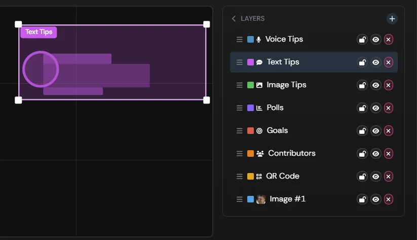
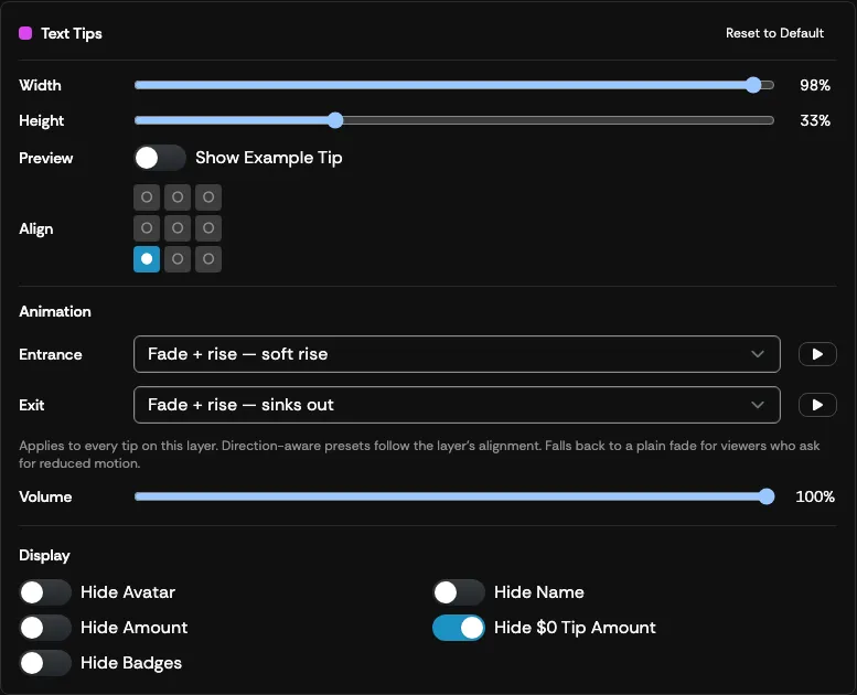
Section titled “Text Tips”To open the Text Tips settings, select the purple Text Tips box from the LAYOUT section, or select the Text Tips option from the LAYERS box. These settings control how Text Tips appear on your overlay.
| Setting | What it does |
|---|---|
| Text Tips Width | Use the slider to adjust the width of the overlay box. |
| Text Tips Height | Use the slider to adjust the height of the overlay box. |
| Show Example Tip | Toggle to show an example of how an actual Text Tip appears on the overlay. |
| Align | Adjusts where the Text Tip aligns within the box on the overlay layout. |
| Entrance / Exit | The animation presets used when a text tip appears and leaves. See Tip animations. |
| Hide Avatar | Hides the viewer’s avatar when the tip is played. |
| Hide Name | Hides the viewer’s name when the tip is played. |
| Hide Amount | Hides the dollar amount the viewer spent on the played text tip. |
| Hide $0 Tip Amount | Zero-dollar tips do not show the dollar amount. |
| Hide Badges | Hides the viewer’s badges when the tip is played. |
| Volume | Sets the level of any Announcer sound or spoken line that plays with text tips on this overlay, from 0% to 100%. Text tips are otherwise silent. |
| Reset to Default | Returns the Text Tip overlay settings, including its animations, to their defaults. |
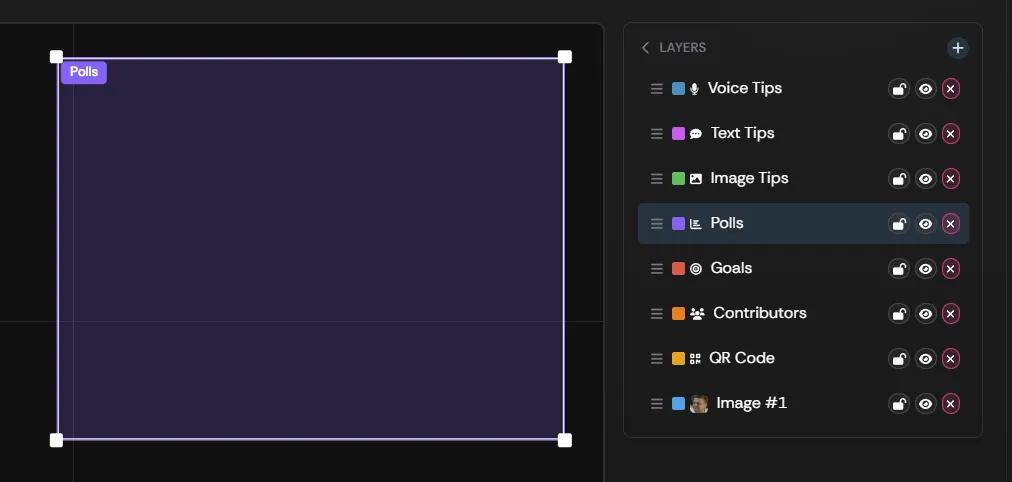
To access your Polls overlay settings, select the purple Polls box from the LAYOUT section, or the Polls option from the LAYERS box.
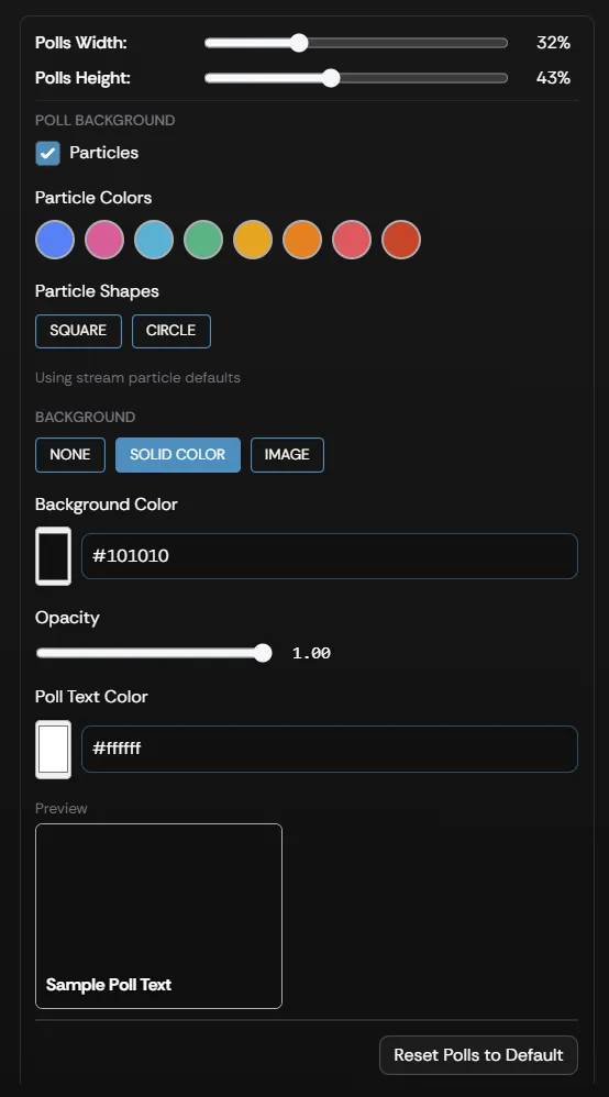
| Setting | What it does |
|---|---|
| Polls Width | Use the slider to adjust the width of the Polls overlay box. |
| Polls Height | Use the slider to adjust the height of the Polls overlay box. |
| Particles | Enables a particle effect when displaying your Poll. |
| Particle Colors | Select the color of the particle effect. |
| Particle Shapes | Select the shape of the particle effect. |
| Background | Allows you to use a background in your Poll overlay. See Background below for the available modes. |
| Background Color | Select the color of your Poll background if SOLID COLOR is selected from the Background option. |
| Poll Text Color | Select the color used in the text of your Poll. |
| Preview | Shows a preview of what your Poll will look like on your Overlay. |
| Reset to Default | Resets your Polls overlay settings back to their default settings. |
Background
Section titled “Background”The Background setting controls how the area behind your Poll appears on the overlay. Three modes are available:
| Mode | Behavior |
|---|---|
| NONE | The background will be transparent. |
| SOLID COLOR | The background will be the color you select from the Background Color option, and the transparency will be set to your selection from the Opacity slider. |
| IMAGE | Allows you to upload an image for use as the Poll background. You can set the transparency of the image using the Opacity slider, and choose how the image fills the poll area with the Image Fit option (Cover, Contain, or Stretch). |
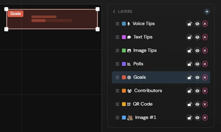
To open the Goal settings, select the red Goals box from the LAYOUT section, or select the Goals option from the LAYERS box. These settings control how Goals appear on your overlay.
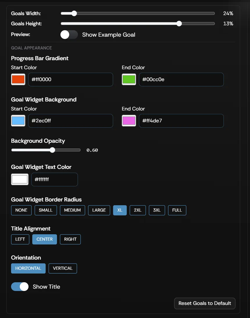
| Setting | What it does |
|---|---|
| Goals Width | Use the slider to adjust the width of the Goals overlay box. |
| Goals Height | Use the slider to adjust the height of the Goals overlay box. |
| Show Example Goal | Toggle to show an example of how a Goal appears on the overlay. |
| Progress Bar Gradient | Use the Start Color and End Color to adjust the gradient of the Goals progress bar. |
| Goal Widget Background | Use the Start Color and End Color to adjust the gradient of the Goals widget background. |
| Background Opacity | Use the slider to adjust the opacity of the Goals background. |
| Goal Widget Text Color | Adjusts the Goal text color. |
| Goal Widget Border Radius | Adjusts how much rounding is used on the Goal box corners. |
| Title Alignment | Adjusts how the Goal title text is aligned within the Goal box. |
| Orientation | Display the Goal in either a Horizontal or Vertical arrangement. |
| Show Title | Toggles the visibility of the Goal title. |
| Reset to Default | Resets your Goals settings back to their defaults. |
QR Code
Section titled “QR Code”To open the QR Code settings, select the orange QR Code box from the LAYOUT section, or select the QR CODE option from the LAYERS box. Viewers can scan your QR code to open your Supertip page, and you can customize it from these settings or download it as an image file to use anywhere.
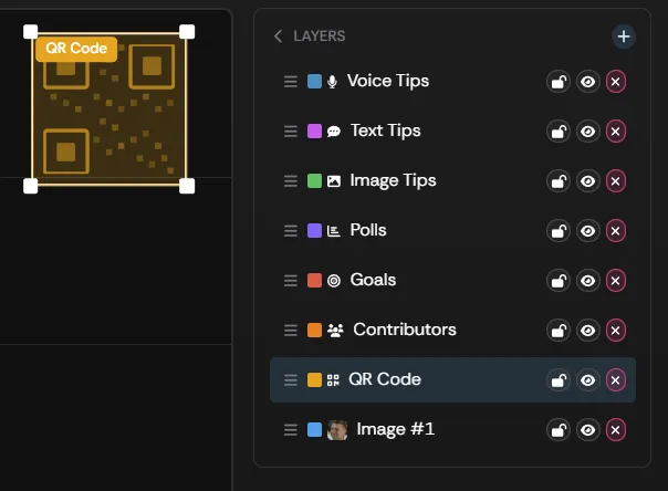
| Setting | What it does |
|---|---|
| QR Code Scale | Use the slider to adjust the height and width of the QR Code overlay box. |
| Reset to Default | Returns your QR code settings to their original values. |
Colors
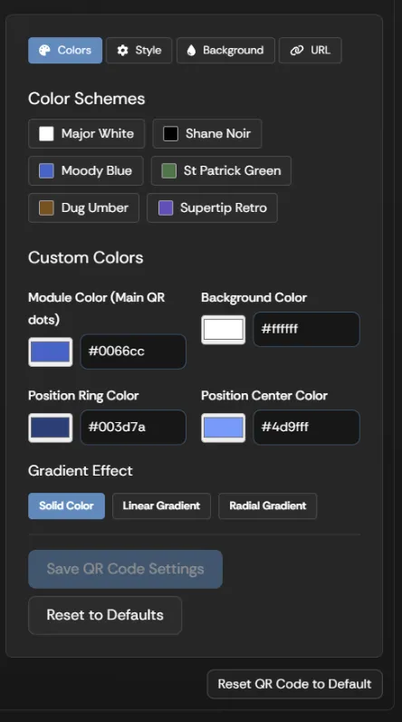
Section titled “Colors”Modify the color and gradient of your QR code by selecting the Colors option.
| Setting | What it does |
|---|---|
| Color Schemes | Select from a number of pre-made QR Code color themes. |
| Custom Colors | Create a custom color scheme using the Module Color, Background Color, Position Ring Color, and Position Center Color selectors. |
| Gradient Effects | Select Linear Gradient or Radial Gradient to add a gradient. Use the Start Color and End Color selectors to choose the gradient colors. The Linear Gradient also lets you set the Gradient Direction. |
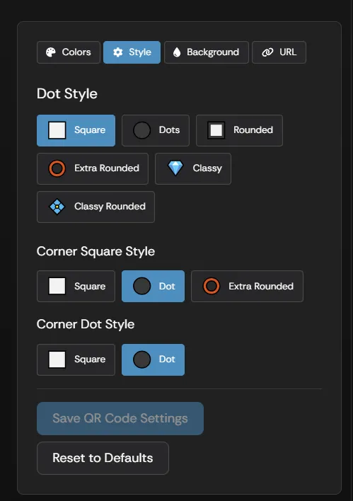
Modify the visual style of your QR code by selecting the Style option.
| Setting | What it does |
|---|---|
| Dot Style | Changes the shape of the small squares that make up the main area of the QR code. |
| Corner Square Style | Changes the shape of the corner squares used in the QR code. |
| Corner Dot Style | Changes the shape within the corner shapes of the QR code. |
Background
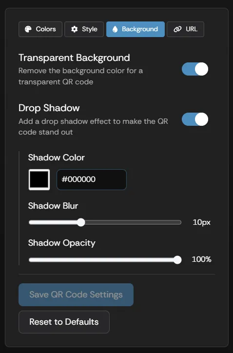
Section titled “Background”Change how the QR code background is displayed by selecting the Background option.
| Setting | What it does |
|---|---|
| Transparent Background | Removes the background color from the QR code. |
| Drop Shadow | Adds a drop shadow effect so the QR code stands out from the contents of your screen. |
| Shadow Color | Sets the color of the QR code drop shadow. Available only when Drop Shadow is enabled. |
| Shadow Blur | Configures the amount of blur in the drop shadow. More blur expands the shadow at a reduced sharpness; less blur gives the shadow a harder edge. Available only when Drop Shadow is enabled. |
| Shadow Opacity | Adjusts the opacity of the drop shadow. Available only when Drop Shadow is enabled. |
You can show your Supertip.gg URL below the QR code by enabling the Show URL Text toggle.
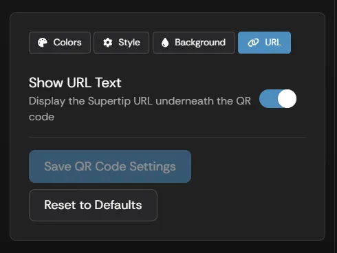
QR code changes are saved with the overlay editor’s Save Changes button, like every other layer. To return the QR Code to its original settings, use the Reset to Default button in the layer’s settings panel.
Image Tips
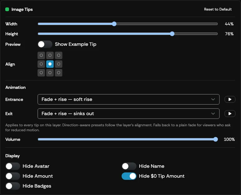
Section titled “Image Tips”To open the Image Tips settings, select the green Image Tips box from the LAYOUT section, or select the Image Tips option from the LAYERS box. These settings control how Image Tips appear on your overlay.
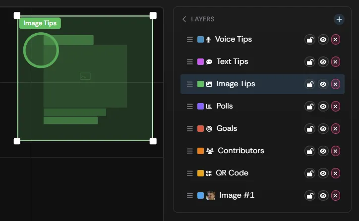
| Setting | What it does |
|---|---|
| Image Tips Width | Use the slider to adjust the width of the overlay box. |
| Image Tips Height | Use the slider to adjust the height of the overlay box. |
| Show Example Tip | Toggle to show an example of how an actual Image Tip appears on the overlay. |
| Align | Adjusts where the tip aligns within the box on the overlay layout. |
| Entrance / Exit | The animation presets used when an image tip appears and leaves. See Tip animations. |
| Hide Avatar | Hides the viewer’s avatar when the tip is played. |
| Hide Name | Hides the viewer’s name when the tip is played. |
| Hide Amount | Hides the dollar amount the viewer spent on the played tip. |
| Hide $0 Tip Amount | Zero-dollar tips do not show the dollar amount. |
| Hide Badges | Hides the viewer’s badges when the tip is played. |
| Volume | Sets the level of any Announcer sound or spoken line that plays with image tips on this overlay, from 0% to 100%. Image tips are otherwise silent. |
| Reset to Default | Returns the Image Tip overlay settings, including its animations, to their defaults. |
Statuses
Section titled “Statuses”The Statuses layer announces on stream when a viewer earns one of your show’s badges — for example, “PixelPenny just earned the Lucky 7 badge!” with the badge artwork beside it. Announcements queue up and play one at a time when the tip that earned the badge starts playing.
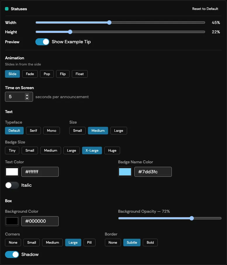
To open the Statuses settings, select the teal Statuses box from the LAYOUT section, or select the Statuses option from the LAYERS box.
| Setting | What it does |
|---|---|
| Width / Height | Use the sliders to adjust the size of the Statuses box. Make it tall enough for your chosen Badge Size, or the whole announcement scales down to fit. |
| Show Example Tip | Toggle to loop an example badge announcement through the box at your configured pacing. |
| Animation | How each announcement moves in and out: Slide (slides in from the side), Fade (soft focus in and out), Pop (springs into place), Flip (tips up like a split-flap board), or Float (rises in, drifts away). |
| Time on Screen | How many seconds each announcement stays on screen, from 1 to 30. |
| Typeface | Default, Serif, or Mono. |
| Size | The text size: Small, Medium, or Large. |
| Badge Size | The size of the badge artwork, from Tiny to Huge. |
| Text Color | The color of the announcement text. |
| Badge Name Color | The accent color used for the badge’s name within the announcement. |
| Italic | Sets the announcement text in italics. |
| Background Color | The color of the announcement box. |
| Background Opacity | The transparency of the announcement box, from 0% to 100%. |
| Corners | How rounded the box corners are: None, Small, Medium, Large, or Pill. |
| Border | The box outline: None, Subtle, or Bold. |
| Shadow | Toggles a drop shadow under the box. |
| Reset to Default | Returns the Statuses position and appearance to their defaults. |
Live Chat
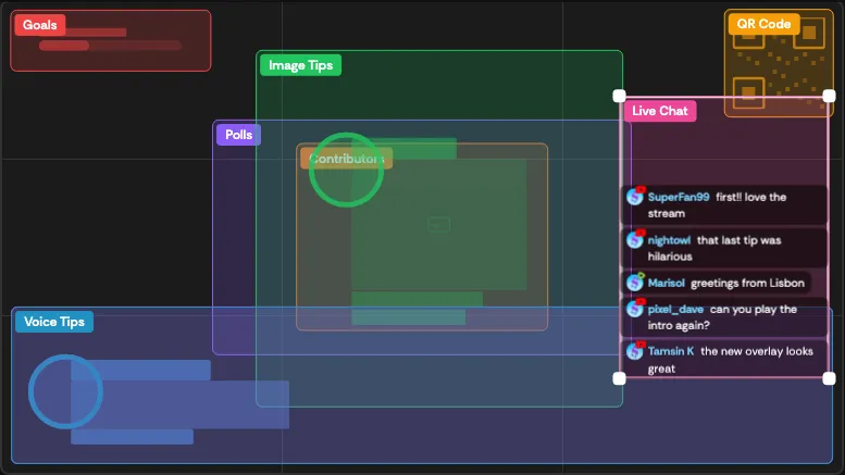
Section titled “Live Chat”The Live Chat layer puts your live chat on stream: a running feed of messages from the YouTube and Rumble channels connected in Broadcast Settings, merged in the order they arrive. Each message shows the chatter’s avatar and name with a small YouTube or Rumble mark, so viewers can tell where it came from.
To open the Live Chat settings, select the pink Live Chat box from the LAYOUT section, or select the Live Chat option from the LAYERS box.
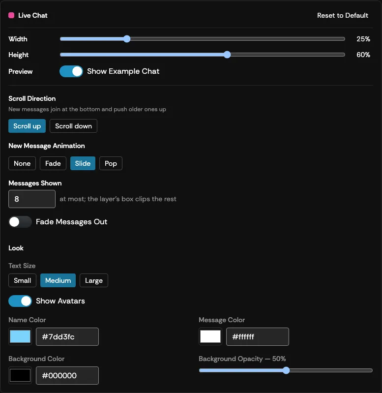
| Setting | What it does |
|---|---|
| Width / Height | Use the sliders, or drag the box’s corners in the LAYOUT section, to size the chat feed. |
| Show Example Chat | Toggle to run sample messages through the box so you can see your settings in action. |
| Scroll Direction | Scroll up adds new messages at the bottom and pushes older ones up; Scroll down adds them at the top and pushes older ones down. |
| New Message Animation | How each new message arrives: None, Fade, Slide, or Pop. |
| Messages Shown | The most messages kept on screen at once, from 1 to 50. Anything that doesn’t fit the box is clipped. |
| Fade Messages Out | Off by default, so messages stay until newer ones push them out. Switch it on and set how many seconds each message stays on screen, up to 600. |
| Text Size | Small, Medium, or Large. |
| Show Avatars | Shows each chatter’s avatar beside their name. With avatars off, the platform mark sits in front of the name instead. |
| Name Color | The color used for chatters’ names. Everyone gets the same color. |
| Message Color | The color of the message text. |
| Background Color | The color behind the feed. |
| Background Opacity | The transparency of the background, from 0% to 100%. |
| Reset to Default | Returns the Live Chat position and appearance to their defaults. |
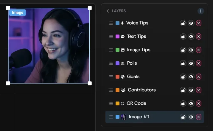
The image overlay lets you add any static image to your overlay.
To open the Image settings, select the image box from the LAYOUT section, or select the Image option from the LAYERS box.
| Setting | What it does |
|---|---|
| Image Width | Use the slider to adjust the width of the image. |
| Image Height | Use the slider to adjust the height of the image. |
| Fit | Choose how the image fills the box. Contain sizes the image to fit within the box area, keeping its aspect ratio. Cover fills the box area without distorting the image, cropping the overflow. Stretch sizes the image to the exact box dimensions, which may distort it. |
| Fill Canvas | A separate size button that snaps the box to cover the entire overlay. The selected fit mode still controls how the image fills it. |
| Reset to Default | Resets all image overlay settings to their defaults. |
Contributor
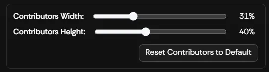
Section titled “Contributor”The contributor overlay displays the usernames and corresponding tip dollar amounts that have contributed to the goal.
To open the Contributor settings, select the Contributor box from the LAYOUT section, or select the Contributor option from the LAYERS box.
| Setting | What it does |
|---|---|
| Contributors Width | Use the slider to adjust the width of the Contributors overlay box. |
| Contributors Height | Use the slider to adjust the height of the Contributors overlay box. |
| Reset to Default | Resets all Contributors overlay settings to their defaults. |